Your Guide to Painting Beautiful Flowers using Watercolor Brush Pens
Posted by Profound Color on

We're big fans of watercolor brush pens! In fact, you can read all our praises for the medium in our blog: how you can take your art to the next level with watercolor brush pens. But, to sum it all up, we love them for their convenience and versatility.
Watercolor brush pens allow for seamless blending, soft ombres, dreamy gradients, and full washes of color. This is all thanks to their water-soluble, dye-based ink and their flexible brush tips that allow for both thin and bold strokes.
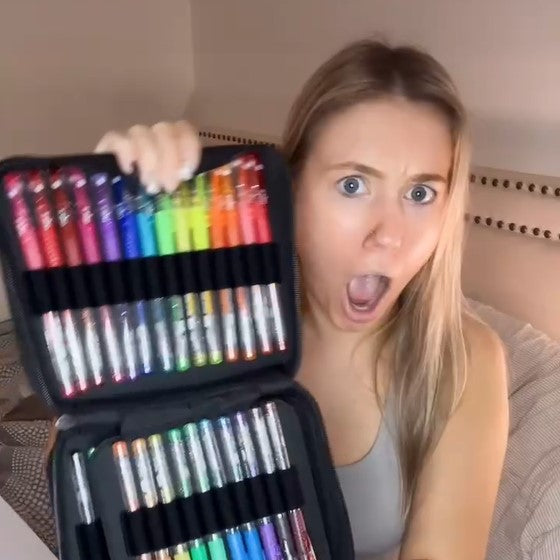
And, today, we’ll be teaching you how to color flowers using watercolor brush pens featuring our very own ColorIt Watercolor Brush Pens and a page from Colorful Flowers Volume II.
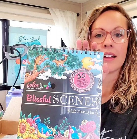
The second installment of our Colorful Flowers coloring book series features 50 life-like illustrations of exquisite bouquets, lush gardens, and dreamy fields of wildflowers. Ideal for all types of colorists, Colorful Flowers Volume II features ColorIt’s signature artist-quality thick paper, hardback book covers, top spiral binding, and bonus ink blotter page where you can test out colors and techniques.
For this tutorial, we’ll be coloring in this radiant sunflower - also known as the flower that represents happiness, joy, and cheer in human life. Join us as we bring to life its bright yellow petals and tall green stems using our watercolor brush pens!

If you want to color along, tcheck out our step-by-step tutorial for beginners on how to paint flowers with watercolors on our youtube channel titled, Colorful Conversations video on How to Color Flowers with Watercolor Brush Pens.
Watercolor Brush Pen Techniques You Need To Know
We know you’re excited to color in your page, but we want you to know these five things first!
Finding a good art reference photo
One of the biggest misconceptions is that people shouldn’t use references when making art, but references are great tools that even expert artists and colorists use.
References give you an objective idea of what an object looks like - colors, shapes, patterns, texture. You could use it to identify where shadows fall if the light is at a certain angle. They give you an idea of what colors to pick. And, most importantly, references give you the inspiration to start. So go on Google or Unsplash.com and search for photos you can use for your page.
Check out the references our guest artist Arvin picked for this piece:

How to choose a watercolor palette
Now that you have a reference photo, it is time to pick a palette. You can do this by first identifying the dominant colors you see on your reference photo then matching it from your set of ColorIt Watercolor Brush Pens.
So you don’t feel as overwhelmed, we suggest focusing on an area of the illustration. Since Arvin is doing a color wash on the sunflower first, he picked out a yellow and green for the petals and the stems then a peach and blue to use for shading later.

For palettes, you can use the colors you see on your reference photo or come up with your own!
Conduct a watercolor color test
Before coloring in your page, test your colors and your watercolor brush pens on a separate piece of paper. Preferably, the paper should be made of the same material as your page so you get a general idea of how the medium performs.
All our adult coloring books, including Colorful Flowers Volume II, come with a blotter page made out of the same artist-quality, 175 gsm paper as our illustrated pages. It is also thick and made to handle wet mediums like our watercolor brush pens.
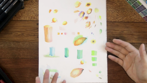
Our guest artist, Arvin, encourages everyone to test out colors on the blotter page each time you add a new color, so you get a general idea of what it looks like once it hits paper.
Try practicing different strokes, blending two colors together, or our next tip - diffusing intensity.
How to diffuse or reduce color intensity
Newly opened watercolor brush pens produce a really intense color, which you may have trouble diffusing as the ink settles on to the paper.
What you'll want to do is:
- Transfer a bit of color from your watercolor markers onto a separate palette.
- Take a clean brush and dip it in water. Make sure to remove any excess water, so that it is damp to the touch instead of soaking wet.
- Collect some of the watercolor on the palette and give your subject a light wash of color.

Pick three colors that go together
Creating depth using multiple colors can be a bit overwhelming, which is why… we recommend starting with three instead. A pale color that will act as your base, a darker color for your shadows, and a color in between that you can use to blend the two together.

How to Watercolor Flowers
Now that you have the basics down, it’s time to color flowers! For this section, we’ll teach you how to watercolor flowers step by step so read along.
Paint a color wash over a large area
Watercolor washes are great for covering large areas. Since watercolor ink is water-based, you can move it around the paper or reactivate them and create stunning effects. You can also mix and match interesting color combinations as well.

For this piece, we want to give our centerpiece a light wash since the sunflower’s covers a bit of area. Take a pale yellow and green and diffuse the intensity by transferring a bit of the color from your watercolor brush pen to a palette (see tip above). Then, with a damp brush dipped in water, swirl the color.
Use this technique when you’re adding backdrops or landscapes.
Base, shadow, blend
Remember the three colors that go together? The ones that we picked earlier? Well, this is where they come in handy.
With a light hand, begin shading your subject with your base color. Make sure to evenly color the area. Once you’re done, take your deeper shade and focus it around the areas where you think there would be shadows. Finally, top it all off with your blending shade so everything looks seamless.

Remember, it’s base, shadow, then blend.
Start with a light wash of color using a pale base, deepen it with your shadow shade, then go over it again to make everything look seamless.
Watch the full effect of base, shadow, blend on a different piece: Coloring and Shading with the ColorIt Watercolor Brush Pens - Butterfly Timelapse
Learn where to add shadows using hatching lines
Illustrated pieces usually have closely spaced lines called hatching lines, which are used to create a tonal or shading effect. You can start off by lining them with your deep color then shading where you think it would cast shadow.
Another way to determine where shadows should be is figuring out which shapes overlap. You can tell which shapes are overlapping by looking at the piece from afar and identifying perpendicular lines. Shapes that are "under'' other shapes usually have a lot more shadow. Making them darker would then give the painting more depth.

How to create a cool toned undertone to your watercolor flowers
An undertone is a subdued color that hides behind a dominant color. You’ll usually see the overtone or masstone first before noticing the undertone. You can see it in this piece too.
The leaves in this piece are dominantly green, but a closer look will show an undertone of blue which creates this cool-toned effect.

On the other hand, using a pale yellow or light orange as an undertone would have made the piece look warmer.
You can add a cool tone to your watercolor flowers by going over it with a cool shade such as blue, green, lavender, or gray to shade the shadows. If you want it to look warmer, then go for yellow, orange, or coral. We recommend sticking to a single tone for a harmonious look.
Curious to see if it works? Try it on a piece of paper now. Lay your base, add your shadow, then top it with either a pale yellow or blue!
When to use dark watercolor colors
Watercolor’s greatest strength is its maximum blendability. Most of the time, all you need to do to create a gradient is make a small mark then thin it out while the paint is still wet. This can backfire when you’re using a dark color as it can run, spread, and soil already colored but still wet areas of your piece.
This is why our last but most important tip when you’re coloring with watercolor brush pens is to wait for the piece to dry and then do the darkest colors.

Another reason why you’d want to do this is because when watercolor dries, it becomes permanent. Adding in dark colors last can help cover up any mistakes that you may have made while working with such a fluid medium.
Although you can always correct the mistake early by wetting the area again, you run the risk of ruining the paper of your flowers coloring book.
So, we highly recommend waiting until most of the watercolor is dry before defining your lines or adding in your blissful blacks, dark browns, contrasting purples, or midnight blues.
While you’re waiting for the paint to dry, why not check out some of our videos? We have a full catalogue of tutorials, colorful conversations, and color along videos to keep you busy while you wait for the paint to dry!
Let your imagination bloom!
Painting beautiful flowers using watercolor brush pens doesn't have to be hard, but it does need planning and preparation.
Simple tips like getting your references, palettes, and mediums ready means you're one step closer to achieving the output that you want. Meanwhile, techniques like color washes and base, shadow, blend help create depth and a well-blended effect so a piece has a more polished look. If you want to, you can try out these suggestions and create your own rendition of this page from Colorful Flowers Volume II or any of the coloring books on our Amazon store.
Although the tips we listed here are tried and true, we firmly believe that creativity comes from exploring ideas and letting our imaginations bloom. So, color outside the lines, experiment with colors, and explore techniques outside of these tips until you find the ones that suit your style best!
And, if you’re up for it, why not tell us all about it? Share your favorite tips and tricks with us through support@colorit.com or with the rest of the community on Facebook. We’re always glad to hear from our colorists.
As always,
ColorIt Team
Share this post
- 0 comment
- Tags: adult coloring, adult coloring books, adult coloring pages, how to use watercolor brush pens, Painting Beautiful Flowers, watercolor brush pens, watercolor flowers, watercolor flowers for beginners
0 comment